Matplotlib (맷플롯립)
시각화 작업은 데이터 분석에서 무척 중요한 부분 중에 하나이다.
matplotlib는 matlab과 유사한 인터페이스를 지원하기 위해 만들어진 파이썬 패키지이다.
matplotlib는 다양한 GUI 백엔드를 지원하고 있으며 pdf, svg, jpg, png, gmp, gif 등 일반적으로 널리 사용되는 포맷으로 도표를 저장할 수 있다.
https://matplotlib.org/2.0.2/gallery.html
Thumbnail gallery — Matplotlib 2.0.2 documentation
matplotlib.org
- 라인 플롯(line plot)
- 스캐터 플롯(scatter plot)
- 컨투어 플롯(contour plot)
- 서피스 플롯(surface plot)
- 바 차트(bar chart)
- 히스토그램(histogram)
- 박스 플롯(box plot)
Matplotlib 설치
pip install matplotlib
pyplot 서브패키지
pyplot 서브패키지는 매트랩(matlab) 이라는 수치해석 소프트웨어의 시각화 명령을 거의 그대로 사용할 수 있도록 Matplotlib의 하위 API를 포장(wrapping)한 명령어 집합을 제공
한글 폰트 사용
한글을 사용하기 위해서는 한글 폰트 적용해야 함
import matplotlib
import matplotlib.font_manager

# 폰트 설치 여부 확인
matplotlib.font_manager._rebuild()
sorted([f.name for f in matplotlib.font_manager.fontManager.ttflist if f.name.startswith("Nanum")])


# 폰트 설정
matplotlib.rc('font', family='NanumGothic')
# 유니코드에서  음수 부호설정
matplotlib.rc('axes', unicode_minus=False)
스타일 지정
Color
- http://matplotlib.org/examples/color/named_colors.html
- 색 이름 혹은 약자를 사용하거나 # 문자로 시작되는 RGB코드를 사용
| 문자열 | 약자 |
| blue | b |
| green | g |
| red | r |
| cyan | c |
| magenta | m |
| yellow | y |
| black | k |
| white | w |
Marker
- 데이터의 위치를 나타내는 기호
| 문자열 | 의미 |
| . | point marker |
| , | pixel marker |
| o | circle marker |
| v | triangle_down marker |
| ^ | triangle_up marker |
| < | triangle_left marker |
| > | triangle_right marker |
| 1 | tri_down marker |
| 2 | tri_up marker |
| 3 | tri_left marker |
| 4 | tri_right marker |
| s | square marker |
| p | pentagon marker |
| * | star marker |
| h | hexagon1 marker |
| H | hexagon2 marker |
| + | plus marker |
| x | x marker |
| D | diamond marker |
| d | thin_diamond marker |
Line Style
선 스타일에는 실선(solid), 대시선(dashed), 점선(dotted), 대시-점선(dash-dit) 이 있다.
| 문자열 | 의미 |
| - | solid line style |
| -- | dashed line style |
| -. | dash-dot line style |
| : | dotted line style |
기타
| 스타일 문자열 | 약자 | 의미 |
| color | c | 선 색깔 |
| linewidth | lw | 선 굵기 |
| linestyle | ls | 선 스타일 |
| marker | 마커 종류 | |
| markersize | ms | 마커 크기 |
| markeredgecolor | mec | 마커 선 색깔 |
| markeredgewidth | mew | 마커 선 굵기 |
| markerfacecolor | mfc | 마커 내부 색깔 |
Legend
여러개의 라인 플롯을 동시에 그리는 경우에는 각 선이 무슨 자료를 표시하는지를 보여주기 위해 legend 명령으로 범례(legend)를 추가할 수 있다.
범례의 위치는 자동으로 정해지지만 수동으로 설정하고 싶으면 loc 인수를 사용한다.
| loc 문자열 | 숫자 |
| best | 0 |
| upper right | 1 |
| upper left | 2 |
| lower left | 3 |
| lower right | 4 |
| right | 5 |
| center left | 6 |
| center right | 7 |
| lower center | 8 |
| upper center | 9 |
| center | 10 |
Line Plot
import matplotlib.pyplot as plt

plt.title("Plot")
plt.plot([1, 4, 9, 16])
plt.show()
import matplotlib.pyplot as plt

plt.title('plot1')
plt.plot([10, 20, 30, 40], [1,4,8,15], c='b', lw='5', ls='--', marker='o', ms=10, mec='g', mew=3, mfc='r')
plt.show()
import matplotlib.pyplot as plt

X = np.linspace(-np.pi, np.pi, 256)
C, S = np.cos(X), np.sin(X)
plt.title("Legend Sample")
plt.plot(X, C, ls="--", label="cosine")
plt.plot(X, S, ls=":", label="sine")
plt.legend(loc=2)
plt.show()
Tick 설정
플롯이나 차트에서 축상의 위치 표시 지점을 틱(tick)이라고 하고 이 틱에 써진 숫자 혹은 글자를 틱 라벨(tick label)이라고 한다.
틱의 위치나 틱 라벨은 Matplotlib가 자동으로 정해주지만 만약 수동으로 설정하고 싶다면 xticks 명령이나 yticks 명령을 사용한다.
import numpy as np
import matplotlib.pyplot as plt

x = np.linspace(-np.pi, np.pi, 256)
y = np.cos(x)
plt.plot(x, y)
plt.xticks([-np.pi, -np.pi/2, 0, np.pi/2, np.pi],
          ['-pi', '-pi/2', '0', 'pi/2', 'pi'])
plt.show()
그림의 구조
Matplotlib가 그리는 그림은 Figure 객체, Axes 객체, Axis 객체 등으로 구성된다.
Figure 객체는 한 개 이상의 Axes 객체를 포함하고 Axes 객체는 다시 두 개 이상의 Axis 객체를 포함한다.

pyplot의 subplot을 이용하는 방법
import matplotlib.pyplot as plt

plt.subplot(2,1,1)
plt.plot(x, y, 'r-')
plt.ylabel('result1')

plt.subplot(2,1,2)
plt.plot(x, y2, 'b-')
plt.ylabel('result2')
plt.show()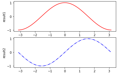
Figure 객체를 사용해서 히스토그램 그래프 그리기
import matplotlib.pyplot as plt

names= ['kim', 'lee', 'choi', 'oh', 'hyo']
y_data = [100, 80, 150, 220, 180]

fig = plt.figure(figsize=(8,6))
ax1 = fig.add_subplot(1,1,1)
ax1.bar(names, y_data)
plt.xlabel('names')
plt.ylabel('sale amount')
plt.show()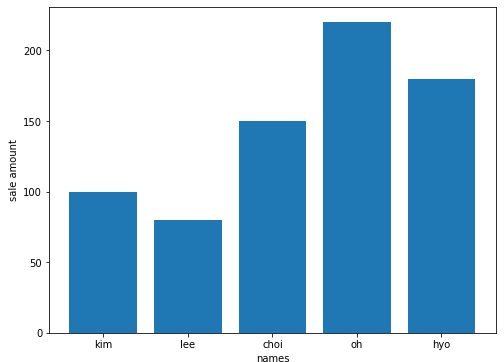
savefig(): 그래프를 파일로 저장
plt.savefig('bar_graph.png', dpi=400)
Box plot
import numpy as np
import matplotlib.pyplot as plt

np.random.seed(0)
normal = np.random.normal(loc=0, scale=1, size=5000)
lognormal = np.random.lognormal(mean=0, sigma=1, size=500)
index_value = np.random.randint(low=0, high=499, size=500)
normal_sample = normal[index_value]

box_plot_data = [normal, normal_sample, lognormal]

fig = plt.figure(figsize=(8,6))
ax1 = fig.add_subplot(1,1,1)

# showmeans는 box 내에 평균값의 위치를 표시하도록 함
ax1.boxplot(box_plot_data, labels=['normal', 'normal_sample', 'lognormal'], showmeans=True)
plt.show()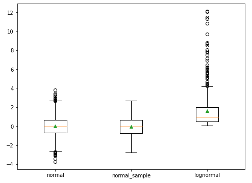
Pandas Series나 DataFrame을 이용해서 그래프 그리기
import numpy as np
import pandas as pd
import matplotlib.pyplot as plt

fig, axes = plt.subplots(nrows=1, ncols=2)
ax1, ax2 = axes.ravel()

data_frame = pd.DataFrame(np.random.rand(5, 3),
                        index=['Customer 1', 'Customer 2', 'Customer 3', 'Customer 4', 'Customer 5'],
                        columns=pd.Index(['Metric 1', 'Metric 2', 'Metric 3'], name='Metrics'))

data_frame.plot(kind='bar', ax=ax1, alpha=0.75, title='Bar Plot')
plt.setp(ax1.get_xticklabels(), rotation=45, fontsize=10)
plt.setp(ax1.get_yticklabels(), rotation=0, fontsize=10)
ax1.set_xlabel('Customer')
ax1.set_ylabel('Value')
ax1.xaxis.set_ticks_position('bottom')
ax1.yaxis.set_ticks_position('left')

colors = dict(boxes='DarkBlue', whiskers='Gray', medians='Red', caps='Black')
data_frame.plot(kind='box', color=colors, sym='r.', ax=ax2, title='Box Plot')
plt.setp(ax2.get_xticklabels(), rotation=45, fontsize=10)
plt.setp(ax2.get_yticklabels(), rotation=0, fontsize=10)
ax2.set_xlabel('Metric')
ax2.set_ylabel('Value')
ax2.xaxis.set_ticks_position('bottom')
ax2.yaxis.set_ticks_position('left')

plt.savefig('pandas_plots.png', dpi=400, bbox_inches='tight')
plt.show()
References
'Data & DataOps > Data Visualization' 카테고리의 다른 글
| [Data Visualization] Bokeh (0) | 2021.05.14 |
|---|---|
| [Data Visualization] Graphviz (0) | 2021.03.05 |
| [Data Visualization] TensorBoard (0) | 2021.03.03 |